People say that data is the new oil, but just like oil, you can only use it to power your business once it’s been processed and prepared for use. Raw data that you can’t use for business purposes can be worse than useless, because you risk ending up overwhelmed and confused by so much information.
This issue has become even more pressing in the last few years. The pandemic accelerated digital transformations, with the result that businesses have more data sources delivering ever-more data to their doors.
Fortunately, new tools and business intelligence (BI) platforms offer advanced data visualizations and responsive dashboards that help you manage your data, organize it, and present it in ways that make it easy to understand and consume.
Organizations that apply advanced data visualization platforms extract the most meaning from their data, giving them insights into customer preferences, better vision into emerging risks and opportunities in the market, and an awareness of inefficiencies and bottlenecks within the business. This confers a competitive edge over their rivals, making it a matter of business success to adopt innovative new data visualization capabilities.
Here are some of the trends to look out for in the future of data visualization.
Data visualization is worth a thousand digits
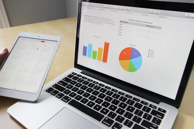
A picture is worth a thousand words, but a good graph may be worth a thousand numbers. Data visualizations have been in use for centuries in the form of maps, charts, and graphs that help people to spot patterns, track trends, and identify changes in business data.
However, traditional data visualizations are non-responsive, and typically use historical data that might be out of date by the time the visualization is completed. It can take a long time, and a great deal of expertise, to create a meaningful visualization, especially when you’re dealing with complex changes and have to account for multiple factors.
Flat, two-dimensional representations often aren’t powerful enough to keep up with the fast-moving, multi-faceted data streams of the 2020s. Thankfully, advanced data visualizations make it possible even for people without a data science background to track complex issues, make data-driven decisions, and tell more engaging, data-based stories.
Drawing in data from multiple sources
One major step forward is that newer data visualization platforms automatically pull data from across the organization. As well as helping prevent dreaded data silos, this makes your visualizations richer and more valuable.
Cloud-based data management systems that use data processing engines can help integrate all your data sources. It can be hard to choose between Databricks or Snowflake, but whichever platform you choose will help raise the level of data quality and increase the reliability of your data insights.
Real time data updates
Another change is the rise of dynamic data visualizations that are constantly updated with real time data, making charts and graphs more accurate and more up to date.
These capabilities are vital for organizations in high-turnover consumer verticals like retail fashion, which depend upon time-critical insights to keep their finger on the pulse of fluctuating trends, but they also help every company to spot operational inefficiencies and bottlenecks within the organization, which can help cut costs and boost profit margins.
Dynamic data visualizations
Today’s data visualization platforms are more dynamic and interactive. Users can zoom in to take a granular level view of a turbulent period, and zoom out to see the bigger picture.
With interactive data visualizations, you can select which factors you want to explore or which time periods to focus on, pull out specific features and compare them against each other, and create unique charts and graphs that help you investigate changes and trends.
Dynamic, customizable dashboards mean that different departments can work with the same data but apply views which meet their needs. Sales and finance might both want to see sales data, for example, but they’ll parse it in different ways and compare it against different elements.
Interactive data experiences
Exciting, cutting edge technology like augmented reality (AR) and virtual reality (VR) is coming to data visualizations, helping to create a more immersive interaction that turns data modeling into an experience rather than just a business exercise.
AR and VR headsets allow people to interact with three-dimensional data visualizations and models that are more impactful and easier to absorb. They support more complex data exploration like advanced risk modeling and long-term demand forecasting, allowing executives to make business decisions with more confidence and act boldly to seize opportunities.
Data storytelling
The future of data visualizations isn’t just about the visualizations themselves, but about what you can do with them. Compelling data visualizations lend themselves to engaging data-based storytelling, which is far more appealing to customers, partners, and shareholders than old-fashioned slides.
BI platforms arrive with intuitive interfaces that are easier to use and simpler to master, lowering the bar to data modeling and allowing everybody to illustrate their positions, decisions, and conclusions with meaningful and engaging visuals.
The future of data visualizations is rosy
Data visualizations are keeping pace with the growing volume and complexity of business data and decisions. By enabling immersive, real-time, dynamic, and accurate data visualizations, businesses can deliver better data-based storytelling and make more confident and transparent decisions, helping the organization grow its bottom line.
Lucas Noah, armed with a Bachelor’s degree in Information & Technology, stands as a prominent figure in the realm of tech journalism. Currently holding the position of Senior Admin, Lucas contributes his expertise to two esteemed companies: OceanaExpress LLC and CreativeOutrank LLC. His... Read more